Everywhere we communicate on behalf of Aembit, we want to honor the company’s foundation: it’s mission, vision, and values.
Vision
The vision of a company is how they see the future of this world.
Aembit envisions a world where every business can safely build its next generation of applications by inherently trusting how it connects to partners, customers, and foundational services.
Mission
The mission of a company is how it plans to contribute to this future vision.
Aembit secures access for distributed applications, supporting APIs, databases, multi-cloud, and B2B. Aembit makes secure access easy.
Values
Brand values is what the company stands for. Every brand decision (and other types of decisions) should be measured against these.
Human
Honesty, transparency, authenticity
Humility
Solving complex problems
Space for iteration, testing, and failure
Brand Feeling, Look & Voice
Brand Feeling
The brand feeling is the emotion we want it to represent and communicate. Here’s how we want Aembit to feel…
"I trust Aembit, they get it"
Vibrant, energetic
Human, welcoming, authentic
Brand Look
The brand look relates to the visual aspect of the brand. Here’s how we want Aembit to look…
Fresh
Minimal
Tech vs human
Lots of tech graphics
Brand Voice
The brand voice is how the copy communication sounds. The Aembit voice should sound like…
"They understand my problem"
Friendly, real people, supportive
Cool and experienced
Simplifying the complex
Brand Colors
Aembit Orange is a key signifier for the brand. Use it to express brand pride with support from Pure White, Aembit Purple, and Aembit Yellow. These are the definitive colors that make up our primary color palette & should be used wherever possible.
Color Palette
#FF5417 Pantone 172C
Aembit Orange Primary-600
#FFFFFF Pantone 000C
Pure White
#291843 PMS Pantone 2695C
Aembit Purple Secondary-600
#FFCC5B PMS Pantone 135C
Aembit Yellow Tertiary-500
Complementary Color Palette
Sometimes you need secondary colors in charts and graphs. Follow the text colors used for each.
Oranges - Primary Color
#FFE6D2
Primary-100
#FFD4BB
Primary-200
#FFC2A3
Primary-300
#FF9970
Primary-400
#FF7946
Primary-500
#FF5417
Primary-600 (main)
#D94100
Primary-700
Purples - Secondary Color
#EDEBEF
Secondary-100
#D5D1DA
Secondary-200
#A59DB0
Secondary-300
#81769F
Secondary-400
#45355D
Secondary-500
#291843
Secondary-600 (main)
#06000E
Secondary-700
Yellows - Tertiary Color
#FFF6E6
Tertiary-100
#FFEFCF
Tertiary-200
#FFE8B8
Tertiary-300
#FFDA89
Tertiary-400
#FFCC5B
Tertiary-500 (main)
#FFB715
Tertiary-600
#E99A00
Tertiary-700
Brand Fonts
Use these in all of your presentations and marketing elements.
Headers
Be Vietnam Pro Semi-Bold
Aa Bb Cc Dd Ee Ff Gg Hh Ii Jj Kk Ll Mm Nn Oo Pp Qq Rr Ss Tt Uu Vv Ww Xx Yy Zz
Paragraphs
Be Vietnam Pro Normal
Aa Bb Cc Dd Ee Ff Gg Hh Ii Jj Kk Ll Mm Nn Oo Pp Qq Rr Ss Tt Uu Vv Ww Xx Yy Zz
The Aembit wordmark & icon are an important expression of our brand identity. By applying the wordmark in a consistent manner, it strengthens the recognition & visibility of our brand.
This is our primary logo. Note the horizontal lockup.
When the primary logo doesn’t fit your composition, use the vertical lockup.
Logo Clear Space
The ‘e’ of the wordmark defines the specific amount of space that a logo must have on all sides, no matter where it is used. The reason for clear space is to ensure that a logo maximizes visibility & impact.
Our logo should always have space to breathe.
The space around our logo is important. Please don’t put stuff in it.
Logo Colors
Follow these guidelines when using the logo on different types of backgrounds.
On light backgrounds, use our full-color logo.
On dark backgrounds, use our full-color logo with white text.
Need one color? Use one of our purple logos.
On darker colored backgrounds, use our white logos.
Logo Don'ts
When downloading Aembit logos from our site, use the logos as they are. Do not attempt to recreate or move logo elements.
“aembit” should never be used without the icon.
Alternatives: Use a vertical logo if horizontal space is limited.
Please don’t change the color of any parts of the logo.
Alternatives: Use other pre-approved color options when the main logo doesn’t work.
Please kindly refrain from using a grayscale version of the logo.
Alternatives: Use other pre-approved color options when the main logo doesn’t work.
Do not rotate the logo.
Alternatives: Use a vertical logo if horizontal space is limited.
Do not change the logo elements’ proportions.
Alternatives: Use a vertical logo if horizontal space is limited.
Please do not add shadows to the logo.
Alternatives: Use other pre-approved color options when the main logo doesn’t work well on backrgound.
Please do not use logos that blend into the background.
Alternatives: Use other pre-approved color options when the main logo doesn’t work well on backrgound.
Do not use logos that blend into the photography.
Alternatives: Use other pre-approved color options when the main logo doesn’t work well on backrgound.
Shapes
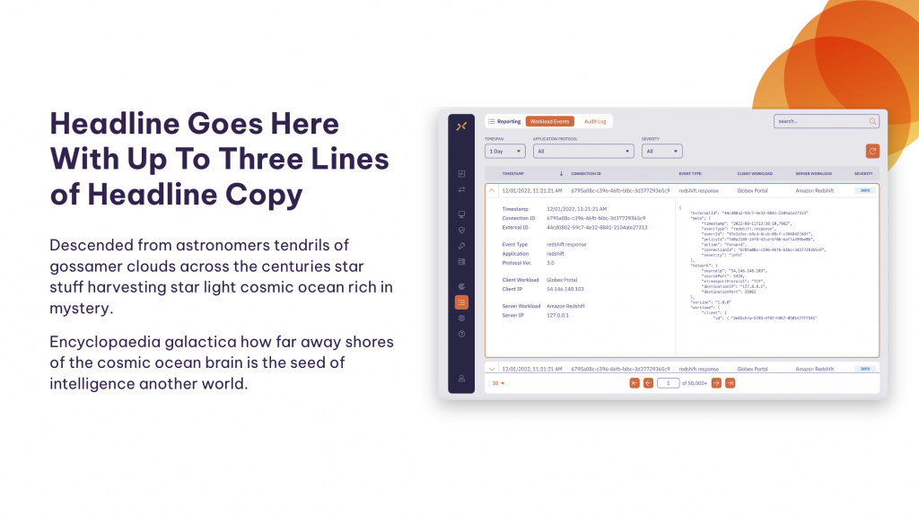
The Aembit shapes support the company vision and are also an important part of our brand identity.
Our product operates at the intersection of security and operational efficiency. These shapes emphasize intersections and collaboration and convey how your team works in unison with our product’s functionalities.
Use these shapes to support your messaging.
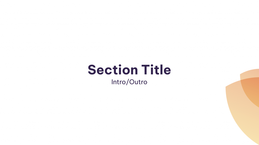
Section background shapes
Always lighter in color and coming out of the screen.
Circles represent people, teamwork.
Shields represent security.
Lines represent the edges, boundaries, where Aembit exists.